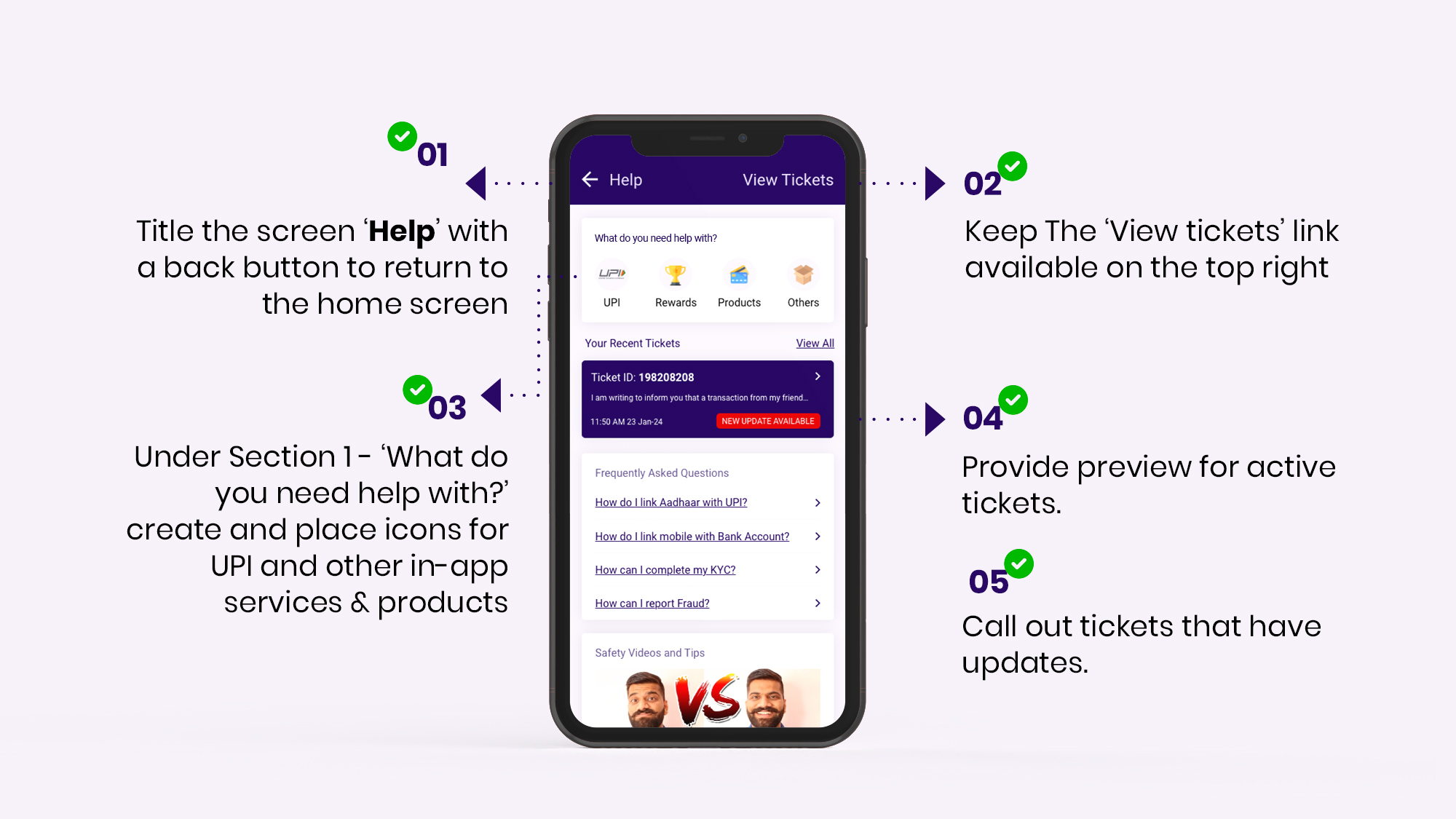
From the Home screen, users arrive at the Help Landing screen. This screen provides the initial non-specific support as the intent of the user is not yet clarified to the application.
Categorising help subjects in the following order allows the user to select an entry point without being overwhelmed with choices.
Section 1
What do you need help with?
Categorise your key application offerings here for the user to select from. For best readability, the recommended label for UPI related transactional support is ‘UPI help’ along with the UPI icon.
Section 2
Your Active Tickets
Use this space to display active tickets. Additionally, call out tickets that are pending a response or have an update.
Optimising space
Use the subsequent space to add suitable sections for your application. These sections may have information to help the user learn or understand the features of the application.
UX Guidelines
✅ DO
- Title the screen ‘Help’ with a back button to return to the home screen
- Keep The ‘View tickets’ link available on the top right.
- Under Section 1 – ‘What do you need help with?’ create and place icons for UPI and other in-app services & products.
- Provide preview for active tickets
- Call out tickets that have updates

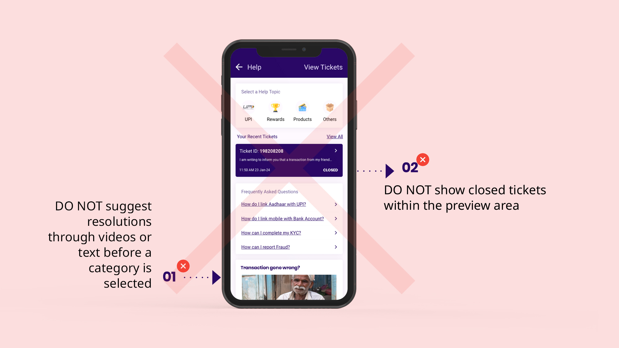
❌ DO NOT
- DO NOT provide any resolution options in the form of videos or text in the Help Landing Page or any other section of GRM unless the user has selected the relevant category and sub-category of issue within the Help Navigation Tree
- DO NOT show closed tickets within the preview area.

UX Writing Glossary
| Term Description | English | हिंदी (Hindi) |
|---|---|---|
| Section 1 Title (For entry point into various help sections) | What do you need help with? | आपको किसमें सहायता चाहिए? |
| Label along with UPI Icon (For entry into UPI GRM) | UPI Help | UPI मदद |
| Label for Ticketing - to view all tickets | Tickets | टिकट्स |
| Section title where active tickets are Displayed | Active Tickets | आप का टिकट |
| Text link to access all tickets from the Active tickets section | View All | सारे टिकट्स |
